Hey Guest!

 Hey - did you know if you click on the title of a thread it will take you to the first unread post since you last visited that thread?
 but were afraid to ask:
  STOP!! Never post your email address in open forums. Bots can "harvest" your email! If you must share your email use a Private Message or use the
  smilie in place of the real @
 Pretty Please - add it to our Events forum(s) and add to the calendar! >>
David Townsend
Jedi Trainee
Offline
I started this thread (barely) over in the Austin Healey forum and it was suggested that I ought move it over here. If you own one of the big Healeys, you may have seen my work. If not and this is your first look, I illustrate British cars and have recently completed my series on the 100-2, 100-6, and 3000s. You can hit the link at the end of this post to check out those and many more.
One of the more frequent questions I'm asked is "How do you do that?" While it probably isn't practical to try and cram 40 or so years of learning into a post, I thought it might kind of fun for you to follow along while I develop the illustration. The only caveat is to keep in mind that this is a work in progress which means everything and anything is subject to changes, revisions, and edits until I get the final drawing. When it's all said and done, I'll have the frog eye, the Spridgets, one of the Sebring cars and one of the WSM cars available.
Lastly, and certainly not least, while I build and work on my own cars and can claim to have owned and driven a bug eye, I'm utterly dependent on the collective knowledge of the group to get things right. So, if you have a question or see something that doesn't look quite the way it should, please, chime in. Many hands make light work.
So, without further delay:
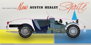
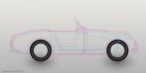
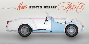
Frame 1—The cyan outlines are Gerry's original lines for the Sprite, including the pop-up headlamp. The magenta outline is the profile as the car was eventually produced. This was the first time I have overlain the two profiles and it was interesting to see the differences between the two—some significant, others not so much. The big one, at least for me, is the original idea of the sloped nose. Would have made a great looking car.

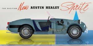
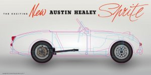
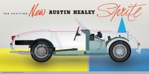
Frame 2—Here I've penned in the wheels (both left and right sides) as well as the differential, drive shaft, suspension bits and rear brakes. I also added the turn lamps and tail lamp to help give me some reference points for other parts to come later. These are only roughly positioned for now and will likely be nudged here and there as the illustration progresses. I also decided to pick up on some of the period advertising for the background.

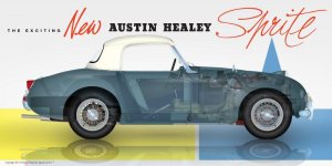
Frame 3—I've roughed in the basic parts of the monocoque and have added a few small bits (regulator, fuse black, signal flashers, etc.) to help give a sense of scale for things. I also added the front bumper, fuel cap, steering wheel and hub caps. Each new piece that gets added, means having to go back and adjust the opacity of the previous items to achieve a good transparent appearance. Each time I add something to the illustration, I delete the magenta guides to help reduce the visual clutter while I work.

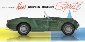
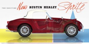
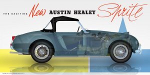
Frame 4—Lots of adjustments plus I decided on leaf green for the initial color )although all of my illustrations are always available in your choice of the factory exterior and interior colors). In this frame, I've adjusted the chassis panels to correspondence more correctly to the profile as well as scaled several of the items previously drawn. The blower motor, wiper motor, battery, headlamp, spare, exhaust, and a few other small things have also been added. WARNING—GEEK CONTENT AHEAD! One of the conundrums of this style of cutaway is that something always seems to obscure a bit of interesting detail and it can be a real challenge to come up with clever ways to try and show as much as possible. Case in point is the wiper motor, most of which is hidden by the blower motor. To make the wiper "visible" I created two identical layers and sandwiched the blower between them. Then by lowering the opacity of the upper most wiper layer, I get the effect of being able to see through the blower (which is actually completely opaque).
As I may have previously mentioned, having been the ad game for most of my career, I'm really fond of period advertising. The Sprite ads from the 60s are particularly fun and I thought it would be interesting to bring in a few more elements to see what they might look like. I'm pretty sold on the text line above the illustration but the jury is still out (at least for me) on the color blocks. They'll stay for now but might be gone when I get to the final.

I'm not going to make any wild promises about how often or quickly I'm going to add to this thread but will try and be as reasonably regular as the work will allow.
If you're no familiar with my work and would like to check things out, visit Sports Car Art. If you're interesting in getting on the notification for this illustration, there's a short sign-up form under the Resources tab.
Hope you enjoy watching the Sprite come together as much as I enjoy drawing it.
One of the more frequent questions I'm asked is "How do you do that?" While it probably isn't practical to try and cram 40 or so years of learning into a post, I thought it might kind of fun for you to follow along while I develop the illustration. The only caveat is to keep in mind that this is a work in progress which means everything and anything is subject to changes, revisions, and edits until I get the final drawing. When it's all said and done, I'll have the frog eye, the Spridgets, one of the Sebring cars and one of the WSM cars available.
Lastly, and certainly not least, while I build and work on my own cars and can claim to have owned and driven a bug eye, I'm utterly dependent on the collective knowledge of the group to get things right. So, if you have a question or see something that doesn't look quite the way it should, please, chime in. Many hands make light work.
So, without further delay:
Frame 1—The cyan outlines are Gerry's original lines for the Sprite, including the pop-up headlamp. The magenta outline is the profile as the car was eventually produced. This was the first time I have overlain the two profiles and it was interesting to see the differences between the two—some significant, others not so much. The big one, at least for me, is the original idea of the sloped nose. Would have made a great looking car.
Frame 2—Here I've penned in the wheels (both left and right sides) as well as the differential, drive shaft, suspension bits and rear brakes. I also added the turn lamps and tail lamp to help give me some reference points for other parts to come later. These are only roughly positioned for now and will likely be nudged here and there as the illustration progresses. I also decided to pick up on some of the period advertising for the background.
Frame 3—I've roughed in the basic parts of the monocoque and have added a few small bits (regulator, fuse black, signal flashers, etc.) to help give a sense of scale for things. I also added the front bumper, fuel cap, steering wheel and hub caps. Each new piece that gets added, means having to go back and adjust the opacity of the previous items to achieve a good transparent appearance. Each time I add something to the illustration, I delete the magenta guides to help reduce the visual clutter while I work.
Frame 4—Lots of adjustments plus I decided on leaf green for the initial color )although all of my illustrations are always available in your choice of the factory exterior and interior colors). In this frame, I've adjusted the chassis panels to correspondence more correctly to the profile as well as scaled several of the items previously drawn. The blower motor, wiper motor, battery, headlamp, spare, exhaust, and a few other small things have also been added. WARNING—GEEK CONTENT AHEAD! One of the conundrums of this style of cutaway is that something always seems to obscure a bit of interesting detail and it can be a real challenge to come up with clever ways to try and show as much as possible. Case in point is the wiper motor, most of which is hidden by the blower motor. To make the wiper "visible" I created two identical layers and sandwiched the blower between them. Then by lowering the opacity of the upper most wiper layer, I get the effect of being able to see through the blower (which is actually completely opaque).
As I may have previously mentioned, having been the ad game for most of my career, I'm really fond of period advertising. The Sprite ads from the 60s are particularly fun and I thought it would be interesting to bring in a few more elements to see what they might look like. I'm pretty sold on the text line above the illustration but the jury is still out (at least for me) on the color blocks. They'll stay for now but might be gone when I get to the final.
I'm not going to make any wild promises about how often or quickly I'm going to add to this thread but will try and be as reasonably regular as the work will allow.
If you're no familiar with my work and would like to check things out, visit Sports Car Art. If you're interesting in getting on the notification for this illustration, there's a short sign-up form under the Resources tab.
Hope you enjoy watching the Sprite come together as much as I enjoy drawing it.
 :banana::banana: