• Hi Guest!
    You can help ensure that British Car Forum (BCF) continues to provide a great place to engage in the British car hobby! If you find BCF a beneficial community, please consider supporting our efforts with a subscription.

    There are some perks with a member upgrade!
    **Upgrade Now**
    (PS: Subscribers don't see this gawd-aweful banner
Tips
Tips

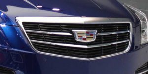
Cadillac has changed its logo.

waltesefalcon

Yoda
Silver
Country flag
Online
cadillac-ats-coupe-detroit-auto-show-2014-3.jpg

This is the quote which accompanied the photo:
'“This new Crest matches the lower, longer, leaner mantra of our current car designs," Andrew Smith, Cadillac's executive design director, said in a press release. The crown last seen before the 2000 redesign has not reappeared — no need to look cocky.'

Anyone else think the "lower, longer, leaner" thing sounds like shades of some other GM head of design?
 
Looks like it's easier to change out with the bow tie emblem now.
 
Sometimes newer isn't better. I'd stick with the original.
 
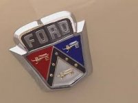
Don't mean to hijack, but this puts me in mind of the long-forsaken Ford logo/coat of arms that I miss:

ford.jpg
 
you miss that? same here!


Yeah - we're ~old~. But that was such a distinctive logo.

I noticed that Mecum Auctions ripped it off:

mecum.jpg
 
Think my G-dad's 55 look something like that
But my memory is like Dave's
 
I believe Ford began dropping the shield in the early 60's; may have kept it on their trucks longer than the cars.

Anyway, I always liked the three lions (or whatever they're supposed to be).
 
Hasn't been the same since Cadillac killed off the merlettes (that's the little ducks, not a singing group)

I hear Cimmaron is fatal to them
 
Back
Top